How to use: Each example shows the same architecture described to the same customer: once as a "Before" (common mistakes) and once as an "After" (Diagram Audit applied). Study the annotation column. The transformations are more about what is removed than what is added.
Example 1: Healthcare Data Lake (Executive Audience)
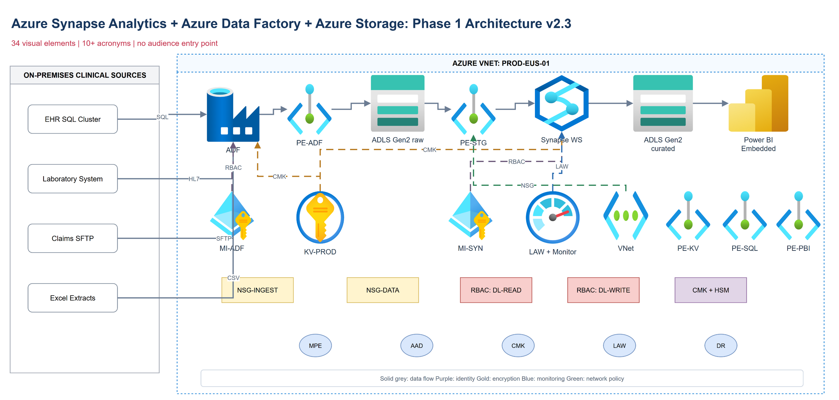
Before: Common CSA First Draft
The architecture is technically plausible, but the audience must decode 34 elements before finding the decision.
Narrative entry point: None: diagram is circular with no clear "start here" element
Before/After: No before state shown: the customer has no frame of reference
Color usage: Azure service-family colors (blue for compute, green for storage, etc.): meaningful to Azure engineers, meaningless to healthcare executives
What happened in the room: The CIO asked three minutes in, "Can you walk us through this at a high level?" The clinical informatics team began debating the Purview configuration. The CFO opened his phone. No decision was made.
After: Diagram Audit Applied
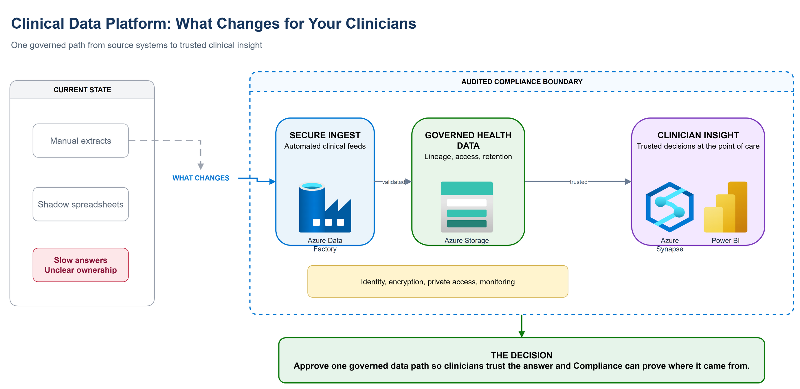
The same Azure services are grouped behind business capabilities, with a clear left-to-right story and one decision.
Title (executive version): "Clinical Data Platform: What Changes for Your Clinicians" [3 words that are the business outcome, not the technology]
Element count: 6 elements: Data Sources (existing), Secure Ingest, Governed Data Store, Clinician Analytics Layer, Compliance Boundary (shaded region), and a "Before" ghost layer showing the current state (Excel + shadow systems)
Acronyms: Zero. "Azure Purview" becomes "Data Governance Layer." "ADLS Gen2" becomes "Secure Health Data Store." Labels are the business function, not the Azure service.
Narrative entry point: Left-to-right: clinical data sources → secure ingest → governed store → clinician use. Arrow direction tells the story.
Before/After: Current state (shadow systems, manual extracts) shown in grey on the left. The new state is in color on the right. The transformation is visible.
Color usage: Grey = current state. Blue = Microsoft-managed. Green = customer-controlled. One color per semantic layer.
What happened in the room: The CIO said, "This is the clearest we've seen the project." The CFO asked one question about the compliance boundary. The clinical team asked about data ownership. All three were the right conversations.
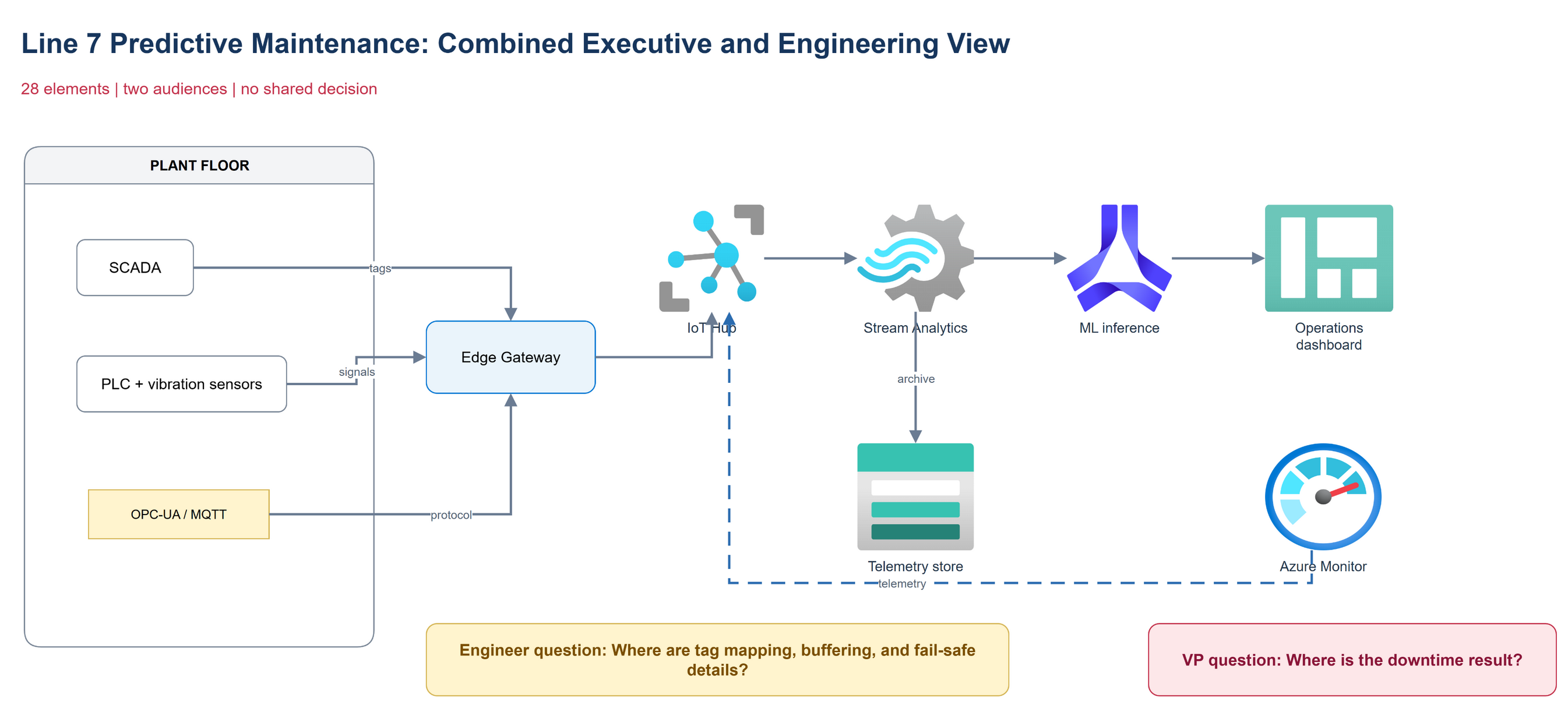
Example 2: Manufacturing IoT (Mixed Audience: VP + Engineering)
Before: Single Diagram for All Audiences
One artifact tries to explain the business outcome and the implementation contract at the same time. Neither audience gets its decision.
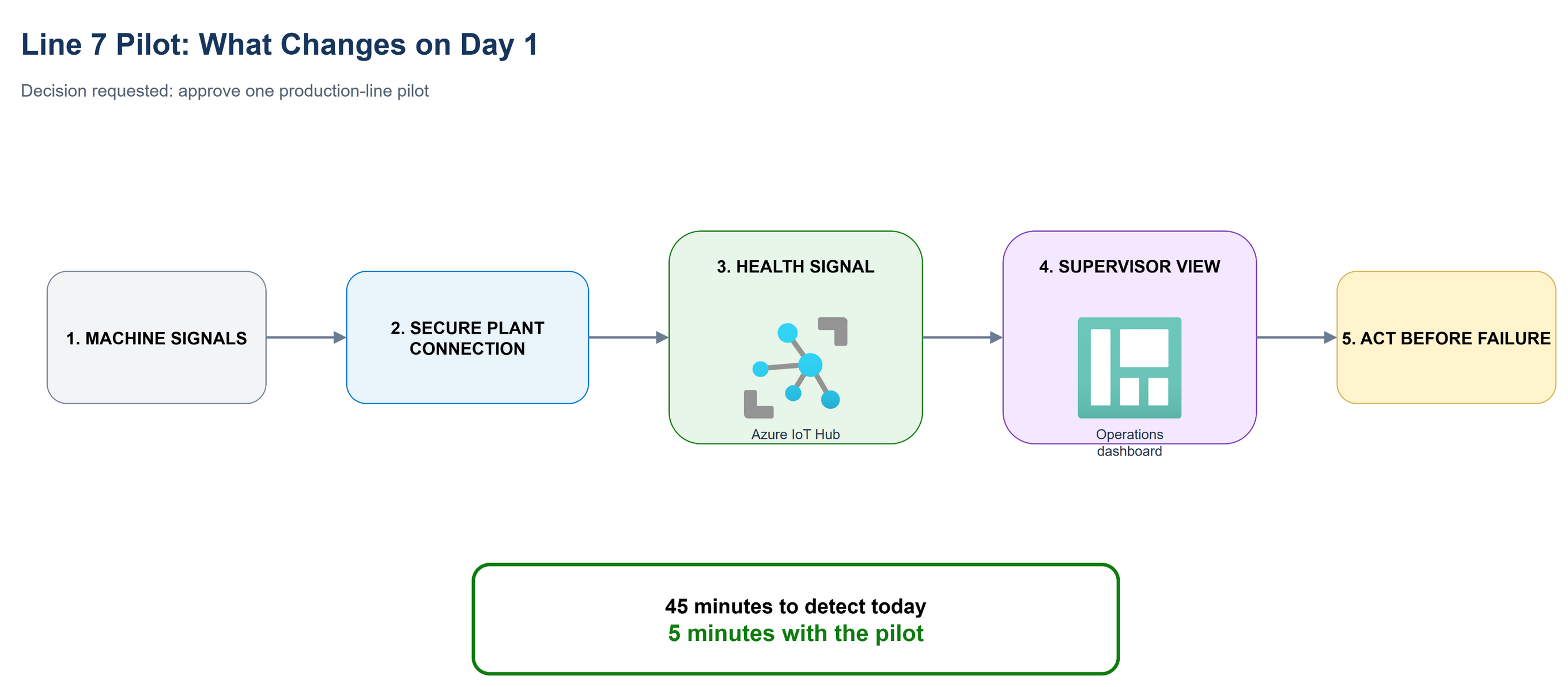
Version A (VP of Operations, 5-minute briefing): 5 elements only. Sensor → Edge Gateway → Azure → Dashboard → Downtime Alert. Title: "Line 7 Pilot: What Changes Day 1." No service names, no technical detail. The visual centerpiece compares 5-minute downtime alerts with 45-minute manual detection today.
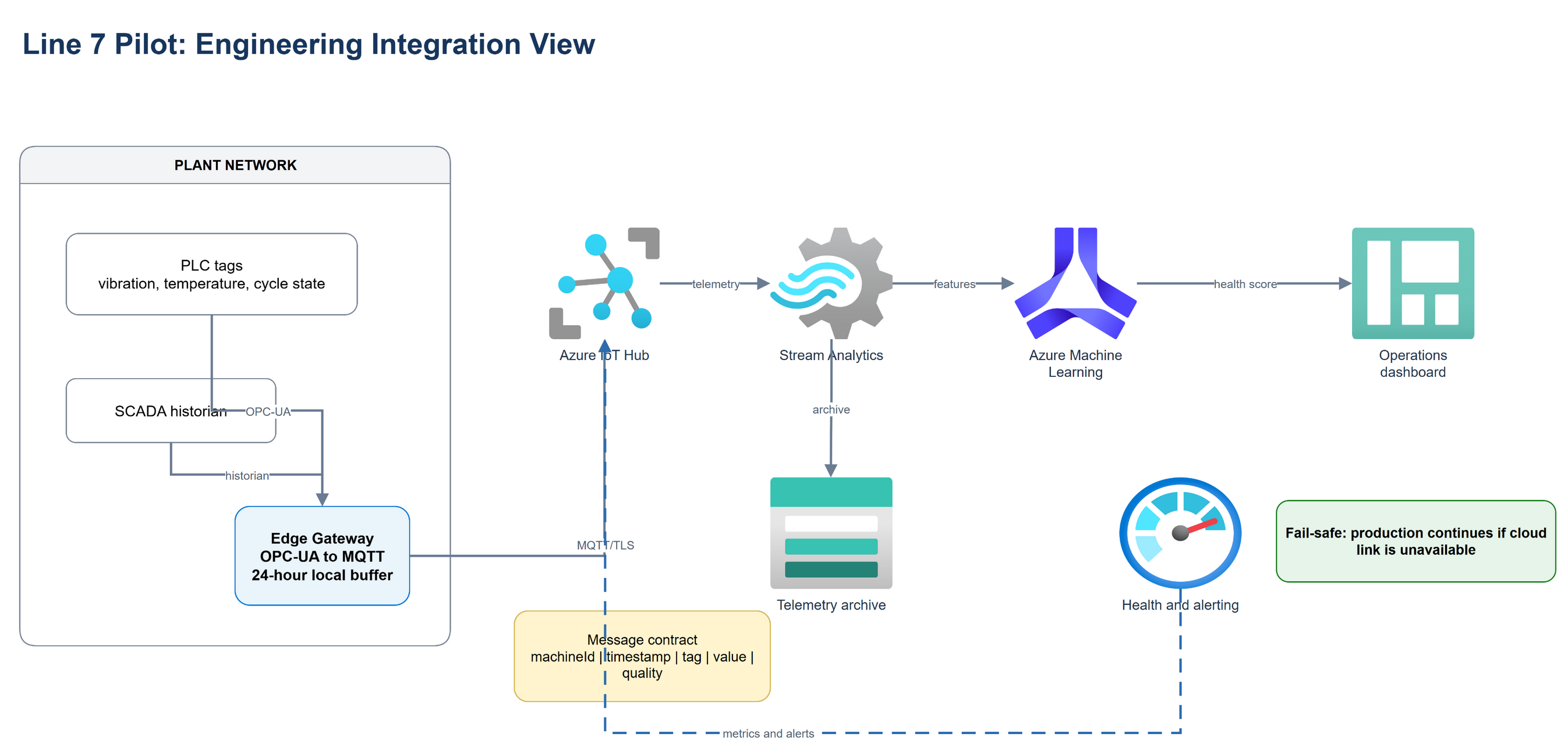
Version B (Engineering team, 45-minute working session): Full architecture with IoT Hub, Stream Analytics, Machine Learning inference, SCADA integration point, OPC-UA protocol detail, and networking. Every technical element present. Separate document; distributed before the meeting so engineers read it before the room discussion.
Key principle: Two versions, two meetings, two decisions. Never show Version B to the VP. Never show only Version A to the engineering team.
Example 3: Financial Services Migration (Stalled Decision)
Before: Architecture That Created the Stall
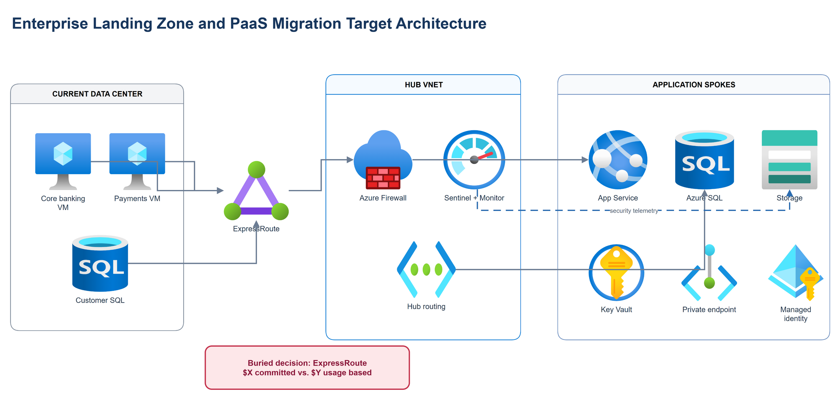
The architecture is clear to a platform team, but the executive decision is a footnote beneath the topology.
The migration proposal showed a technically sound Azure Landing Zone with Hub-Spoke topology, Express Route, Azure Firewall, Sentinel SIEM, and a 14-service PaaS migration target. The CTO loved it. The CFO asked for "something simpler." The project stalled for 6 weeks.
After: Decision-Forcing Redesign
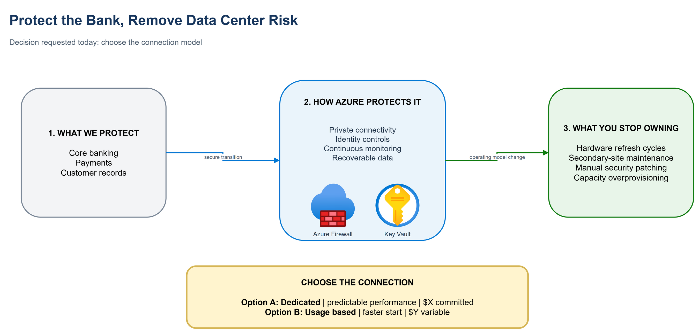
The technical design is summarized as business capabilities, while the connection decision is promoted to the foreground.
The redesign wasn't architectural: it was visual. The same architecture was redrawn as three boxes: (1) "What we're protecting" [current workloads], (2) "How we protect it in Azure" [security and compliance boundary, labeled in business terms], (3) "What you're not responsible for after migration" [list of eliminated costs and risks]. The controversial Express Route decision was surfaced as an explicit binary choice with a $X vs. $Y cost table, not buried in the architecture. The CFO made the decision in 20 minutes.
Annotation Key: The Five Most Common Diagram Mistakes